Inspired by the log-scaled price and earnings charts that Charlie Munger called "one of the great tools ever invented for investors."
Choosing a Valuation Method
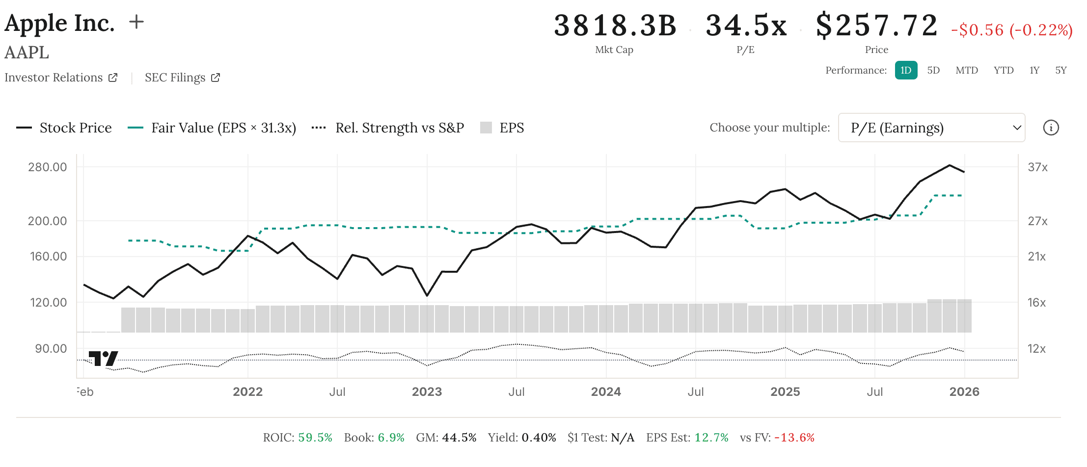
Use the dropdown to switch between four valuation methods:
- P/E (Earnings): Traditional earnings-based valuation. Works well for mature, profitable companies with stable earnings.
- P/FCF (Free Cash Flow): Based on cash generated after capital expenditures. Often preferred for capital-intensive businesses.
- P/CF (Cash Flow): Based on operating cash flow before capital expenditures. Useful when comparing companies with different capital requirements.
- P/OE (Owner Earnings): Based on Buffett's owner earnings concept — cash flow adjusted for maintenance capex. Captures the true economic earnings available to owners.
Fair Value Calculation
The fair value line plots the trailing twelve month fundamental metric multiplied by its median historical multiple (e.g., TTM EPS x Median P/E for the P/E method). When price rises far above this line, the market is pricing in exceptional growth. When it falls below, the market may be overly pessimistic — or the business may be deteriorating.
Free users see P/E. Pro unlocks all 4 methods and 15 years of history.
Tips for Interpretation
- Mean reversion: Stocks tend to revert toward their fair value line over time. Extended periods above or below often correct.
- Consider the context: A stock below fair value isn't automatically a buy — investigate why it might be cheap.
- Multiple methods: If different valuation methods disagree significantly, dig deeper into why (e.g., heavy capital expenditures, one-time charges).